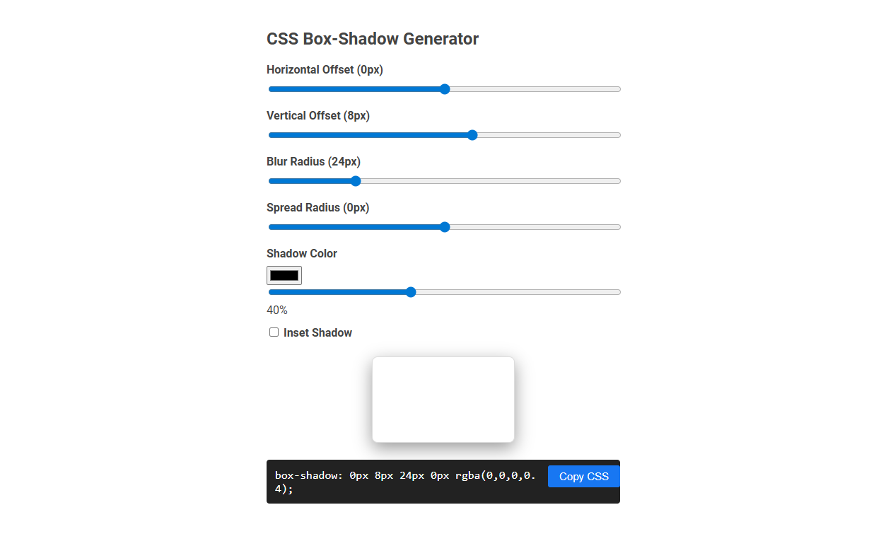
The CSS Box-Shadow Generator tool allows users to visually create and customize CSS box-shadow effects by adjusting parameters like offset, blur, spread, color, and opacity in real-time. This tool helps web designers and developers quickly generate the desired shadow style, reducing manual coding and trial-and-error. Simply adjust the sliders, preview the effect, and copy the generated CSS code for seamless integration into web projects.
How to use this tool?
Complete Guide: How to Use the CSS Box-Shadow Generator Tool
-
Adjust Horizontal Offset:
Use the first slider to set the Horizontal Offset of the shadow (in pixels). Moving the slider right will move the shadow to the right; left will move it to the left of the box. -
Adjust Vertical Offset:
Use the second slider to set the Vertical Offset (in pixels). Sliding to the right pushes the shadow downward; to the left moves it upward. -
Set Blur Radius:
The third slider controls the Blur Radius (in pixels). A higher value makes the shadow softer and more spread out; a lower value creates a harder, sharper edge. -
Set Spread Radius:
Use the fourth slider to manipulate the Spread Radius (in pixels). Increasing this value expands the shadow, while decreasing it contracts the shadow closer to the box. -
Choose Shadow Color:
Click the color input next to "Shadow Color" to open a color picker. Choose your desired shadow color. -
Adjust Opacity:
Below the color input is an opacity (transparency) slider (0-100%). Drag to set how transparent the shadow should appear. -
Toggle Inset Shadow:
Check the "Inset Shadow" option to make the shadow appear inside the box instead of outside. -
Live Preview:
See real-time updates to your box-shadow effect in the preview box as you adjust settings. -
Copy the CSS:
When satisfied, click the "Copy CSS" button. The generated code below will be copied to your clipboard, which you can now paste into your CSS stylesheet.
Tips:
- Experiment with different combinations for unique shadow effects.
- Multiple shadows can be created by manually editing the copied code if needed.
- Use higher blur and lower opacity for a subtle look; use higher spread for a dramatic effect.
Introduction to the CSS Box-Shadow Generator Tool
The CSS Box-Shadow Generator Tool simplifies creating custom shadow effects for web elements by providing an intuitive interface to adjust parameters like offset, blur, spread, and color. It instantly generates precise CSS code snippets compatible with all modern browsers, enhancing design workflow efficiency. Designers and developers save time while ensuring consistent, visually appealing shadows across websites.
Key Features of the Free Online Box-Shadow Tool
The free online CSS box-shadow generator offers customizable parameters including horizontal and vertical offsets, blur radius, spread radius, and shadow color, enabling precise control over shadow effects. Interactive sliders and real-time preview allow you to instantly visualize changes and fine-tune your design. Export-ready CSS code ensures seamless integration into your projects, enhancing productivity and design accuracy.
Step-by-Step Guide: Creating Box-Shadows Effortlessly
Master box-shadow creation with our Step-by-Step Guide: Creating Box-Shadows Effortlessly. This guide breaks down how to adjust horizontal and vertical offsets, blur radius, spread, and color for dynamic shadow effects. Users can visualize real-time changes for precise CSS styling, enhancing web design aesthetics seamlessly.
Adjusting Horizontal and Vertical Offsets
Adjusting the horizontal and vertical offsets in a CSS box-shadow generator controls the shadow's position relative to your element. A positive horizontal offset moves the shadow to the right, while a positive vertical offset shifts it downward. Your precise adjustments help create realistic depth and visual appeal in web design.
Customizing Blur and Spread Radii for Perfect Shadows
Customize blur and spread radii in a CSS box-shadow generator to create perfectly balanced shadows tailored to your design needs. Adjusting the blur radius controls the shadow's softness, while modifying the spread radius influences its size and intensity. Fine-tuning these parameters ensures visually appealing, professional-quality shadow effects for web elements.
Choosing and Tweaking Shadow Colors
Selecting the perfect shadow color in a CSS box-shadow generator enhances the visual depth and realism of web elements. Use RGBA values to adjust opacity for subtle or pronounced effects, matching the shadow tone with the background and light source. Experiment with darker hues for contrast or tinted shadows to complement your design palette, ensuring cohesive and dynamic styling.
Managing Opacity for Subtle or Bold Effects
Managing opacity in a CSS box-shadow generator allows you to create subtle or bold effects by adjusting the shadow's transparency level. Lower opacity values produce delicate, soft shadows that enhance your design without overwhelming it. Higher opacity settings result in strong, prominent shadows that add depth and emphasis to your elements.
Using the Inset Shadow Option for Advanced Designs
Using the inset shadow option in a CSS box-shadow generator allows you to create sophisticated designs by positioning shadows inside an element, adding depth and dimension. This technique enhances user interface components like buttons and cards, making them appear recessed or embossed. Your designs gain a professional, tactile quality that standard shadows cannot achieve.
Instantly Preview and Fine-Tune Your Box-Shadow
Easily create and customize CSS box-shadow effects with our intuitive box-shadow generator. Instantly preview changes in real-time to see the perfect shadow depth, blur, and spread on your element. Fine-tune parameters such as color, opacity, and offset for precise, professional-looking shadows that enhance your web design.
CSS box-shadow generator Tool Preview

