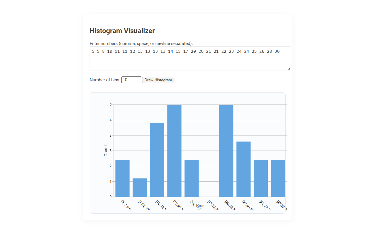
The Histogram Visualizer tool is a data analysis utility that generates histogram charts from a user-provided list of numbers. It helps users quickly visualize the frequency distribution of numerical data, making patterns and trends easier to understand. Usage involves inputting numbers, selecting the number of bins, and then clicking a button to instantly create a visual histogram.
How to use this tool?
Complete Guide: How to Use the Histogram Visualizer Tool
-
Access the Tool:
Open the Histogram Visualizer tool in your web browser. -
Enter Your Data:
- Find the input box labeled "Enter numbers (comma, space, or newline separated):"
- Type or paste your dataset. You can separate numbers using commas, spaces, or by pressing Enter after each number.
- Example:
5, 8, 10, 11, 11, 12, 13, 14, 15, 17, 20, 21, 22, 23, 24, 25, 26, 28, 30
-
Set the Number of Bins:
- Find the "Number of bins" field below the input box.
- Enter how many bins (categories or intervals) you want for your histogram. The default is often 10.
-
Draw the Histogram:
- Click the Draw Histogram button.
-
Interpret the Histogram:
- A bar chart appears below with intervals (bins) on the x-axis and frequencies (counts) on the y-axis.
- Each bar represents how many numbers from your dataset fall into each interval.
- Hovering over or examining the histogram allows you to see how your data is distributed.
-
Explore Further:
- Change your numbers or adjust the number of bins to see how it affects the shape of the histogram.
- Repeat as needed to analyze different datasets or bin settings.
Tips
- More bins show finer detail; fewer bins give a broader overview.
- Ensure your data is correctly formatted before drawing the histogram.
- This tool helps visualize data distribution, outliers, and compare datasets at a glance.
Introduction to Free Online Histogram Visualization Tools
Histogram visualizers provide an intuitive way to analyze data distribution by displaying frequency counts across defined intervals. Free online histogram visualization tools enable you to quickly create and customize charts without software installation, supporting diverse datasets and formats. These platforms enhance data interpretation, making complex statistical insights more accessible for your projects and presentations.
Why Histograms Matter in Photography
Histograms provide a visual representation of the tonal distribution in your photographs, helping you assess exposure accurately. Understanding the balance of shadows, midtones, and highlights ensures your images retain detail without unwanted clipping. Using a histogram visualizer empowers you to make precise adjustments, enhancing the overall quality of your photos.
Key Features of Histogram Visualizer Tools
Histogram visualizer tools offer precise data distribution insights by displaying frequency counts across defined intervals, enabling easy identification of patterns and outliers. Key features include customizable bin sizes for granular analysis, interactive interfaces for dynamic data exploration, and integration capabilities with major data platforms like Python, R, and Tableau. High-resolution rendering and export options enhance reporting and presentation efficiency in data-driven projects.
Step-by-Step Guide: Uploading and Entering Data
The Histogram visualizer enables you to upload datasets effortlessly by selecting your file in supported formats like CSV or Excel. After uploading, enter your data points manually or adjust existing values directly within the interface for precise customization. This streamlined process ensures accurate histogram generation to visualize distribution patterns effectively.
Customizing the Number of Bins for Precision
The Histogram visualizer allows precise control over data representation by customizing the number of bins. You can adjust bin quantity to highlight detailed patterns or general trends in your dataset. Optimizing bin count ensures clearer insights and more accurate analysis outcomes.
Interpreting Histogram Results for Photo Analysis
Histogram visualizers graphically represent the distribution of pixel brightness levels in a photo, enabling precise analysis of exposure and contrast. Interpreting histogram results reveals if an image is underexposed, overexposed, or balanced by showing the spread of shadows, midtones, and highlights. Photographers use this data to adjust settings for optimal detail retention and color accuracy in photo editing.
Enhancing Your Photography Workflow with Histograms
Histogram visualizers provide photographers with precise exposure data by graphically representing pixel brightness levels, enabling accurate adjustments. Utilizing histograms enhances your photography workflow by quickly identifying underexposed or overexposed areas, leading to optimal image quality. Integrating histogram analysis streamlines editing and improves overall photo consistency across various shooting conditions.
Tips for Accurate Data Formatting and Entry
Ensure your data is consistently formatted with uniform units and no missing values to achieve accurate histogram visualization. Use numerical entries and categorize data appropriately to avoid skewed results. Verify data accuracy before importing to enhance the quality of your histogram analysis.
Comparing Multiple Datasets Using Histograms
The Histogram Visualizer enables efficient comparison of multiple datasets by displaying their frequency distributions side by side or overlaid with distinct colors. It highlights differences in data patterns, skewness, and variability, facilitating clear insights into dataset relationships. This tool is essential for statistical analysis, quality control, and data-driven decision-making across fields like finance, healthcare, and marketing.
Histogram visualizer Tool Preview

