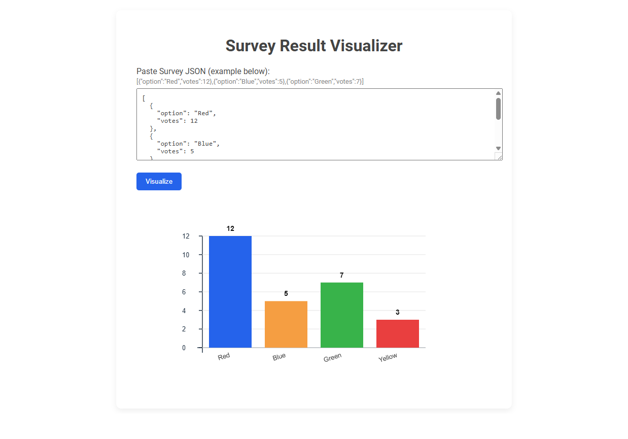
The Survey Result Visualizer tool transforms raw survey data from JSON format into clear and interactive bar charts for easy analysis. Designed to simplify the understanding of survey outcomes, it allows users to paste their survey results and instantly visualize voting distributions. Usage involves copying survey JSON data, pasting it into the input box, and clicking "Visualize" to generate a graphical summary.
How to use this tool?
Complete Guide: How to Use the Survey Result Visualizer Tool
-
Prepare Your Survey Data:
- Gather your survey results. Make sure the data is in JSON format with fields for
optionandvotes. -
Example format:
[{"option":"Red","votes":12},{"option":"Blue","votes":5},{"option":"Green","votes":7}]
- Gather your survey results. Make sure the data is in JSON format with fields for
-
Open the Survey Result Visualizer Tool:
- Visit the web tool where you see the "Survey Result Visualizer" heading.
-
Paste Your Survey JSON:
- Click inside the large text box labeled "Paste Survey JSON (example below)".
- Delete any existing sample data if needed.
- Paste your survey results JSON into the box.
-
Visualize Your Data:
- Click the blue Visualize button below the text box.
- The tool will process your JSON and display a bar chart visualization.
-
Interpret the Results:
- A colored bar chart will appear below the button.
-
Each bar represents a different survey option, and the height shows the number of votes.
- The number atop each bar is the vote count.
- Hover or view each bar to see exact details if supported.
-
Troubleshooting:
- Make sure your JSON format matches the provided example.
- Each entry must have
"option"(the category/answer) and"votes"(a number). - If you see an error, check your JSON for missing brackets or misspellings.
-
Tips:
- You can change the options or votes in your JSON and click Visualize again to update the chart.
- This tool is ideal for quick, visual survey analysis and sharing results with teams.
Introduction: Importance of Survey Visualization for Researchers
Survey result visualization transforms complex data into clear, actionable insights, enabling researchers to identify patterns and trends efficiently. Effective visualization tools enhance data interpretation accuracy, supporting evidence-based decision-making in academic and professional studies. Prioritizing survey visualization accelerates understanding and communication of research findings across diverse audiences.
Key Features of the Free Survey Result Visualizer Tool
The Free Survey Result Visualizer Tool offers intuitive data charts and customizable graphs to simplify your survey analysis. It supports multiple data formats and real-time visualization, enhancing accuracy and efficiency. You benefit from easy export options for sharing insights seamlessly across platforms.
Step-by-Step Guide: Preparing Survey Data in JSON Format
Preparing survey data in JSON format begins with organizing raw responses into key-value pairs, ensuring each question and answer is clearly labeled. Validate the JSON structure using tools like JSONLint to prevent syntax errors that could disrupt visualization. Clean and standardize data entries to maintain consistency, enabling accurate and efficient survey result visualizations.
Accessing and Navigating the Online Visualizer Interface
The Survey Result Visualizer offers an intuitive online interface designed for seamless access and navigation. Users can effortlessly log in through a secure portal and utilize interactive menus to filter, compare, and analyze survey data in real time. Advanced features include customizable dashboards and export options, enhancing data interpretation and presentation efficiency.
How to Paste and Submit Survey JSON Data
To paste and submit survey JSON data in the Survey Result Visualizer, open the tool's input section and insert your JSON code directly into the designated text box. Ensure the JSON structure adheres to the survey schema, including question identifiers and response arrays for accurate parsing. Click the submit button to process the data, enabling the visualizer to generate detailed charts and summaries based on your survey results.
Generating Instant Bar Chart Visualizations
Survey Result Visualizer enables you to generate instant bar chart visualizations that simplify data interpretation. This tool transforms raw survey data into clear, concise graphs, enhancing your ability to analyze trends and patterns quickly. Instant bar charts help streamline decision-making by providing a visual summary of survey outcomes.
Interpreting Survey Result Charts for Deeper Insights
Survey result visualizers transform complex data into clear, interpretable charts that reveal hidden trends and patterns. Leveraging bar graphs, pie charts, and heat maps enables deeper insights by highlighting respondent preferences and behavior correlations. Effective interpretation of these visual tools drives informed decision-making and strategic improvements.
Common Troubleshooting Tips for Data Formatting
Survey result visualizer users often face data formatting issues such as inconsistent date formats, missing values, and improper text encoding. Ensuring your dataset uses uniform date formats like YYYY-MM-DD and filling missing data with placeholders improves visualization accuracy. You can resolve encoding problems by converting files to UTF-8, preventing display errors in charts and graphs.
Best Practices for Sharing and Presenting Visualized Results
Enhance your survey result visualizer by using clear, concise charts and graphs that highlight key insights without overwhelming viewers. Select color schemes and layouts that improve readability and accessibility for diverse audiences. Share interactive dashboards that allow your stakeholders to explore data dynamically, increasing engagement and understanding.
Survey result visualizer Tool Preview

