The Scatter Plot Creator is an interactive tool designed for visualizing and analyzing the relationship between two sets of data points. Users input X and Y values, and the tool generates a scatter plot to reveal patterns, correlations, or outliers. This tool is essential for students, researchers, and data analysts seeking to quickly interpret bivariate data visually.
How to use this tool?
Complete Guide to Using the Scatter Plot Creator Tool
-
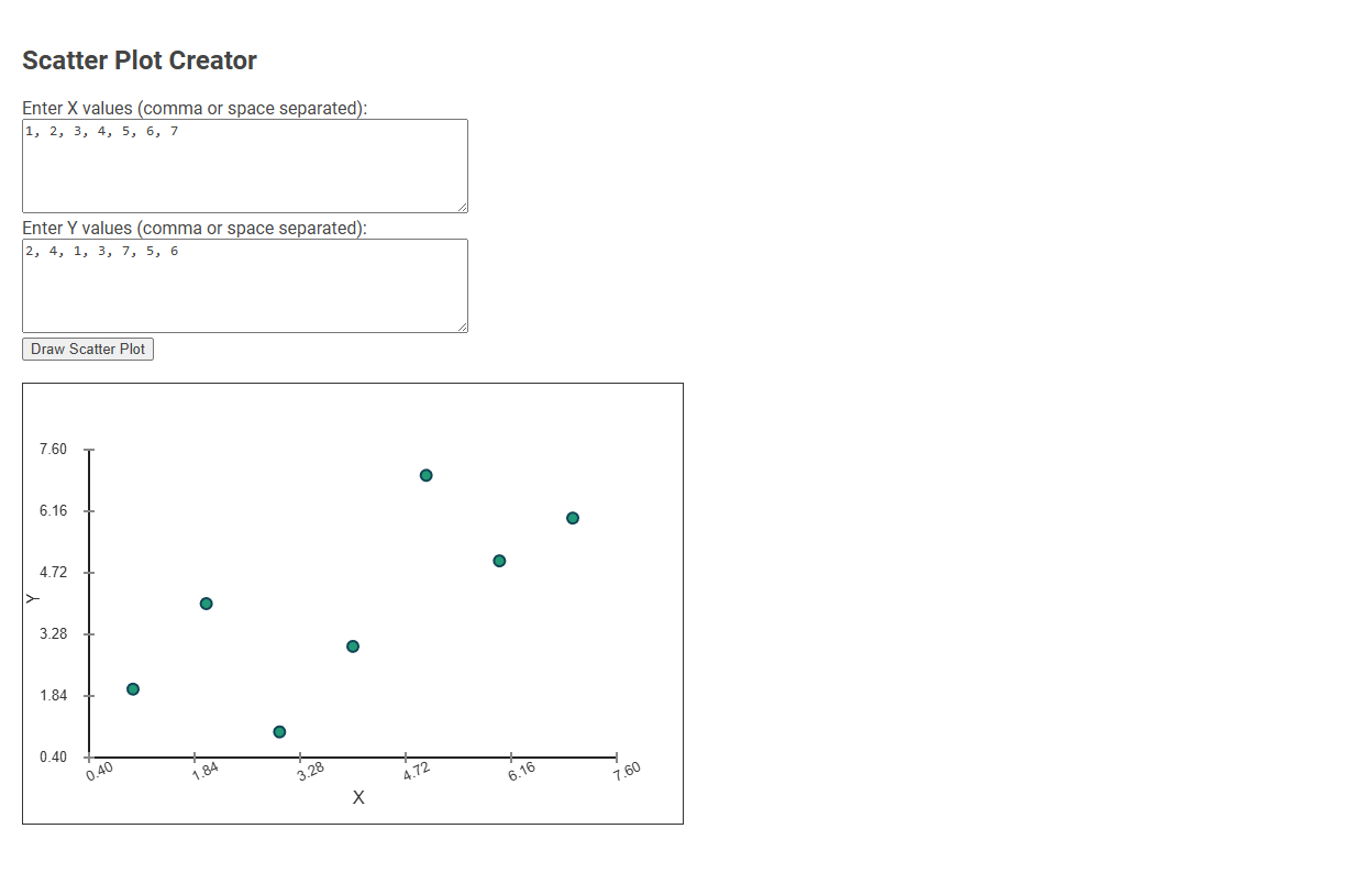
Enter X Values:
In the first text box labeled "Enter X values (comma or space separated):", type the values for the X-axis. Enter each value separated by a comma or a space.
Example:1, 2, 3, 4, 5, 6, 7 -
Enter Y Values:
In the second text box labeled "Enter Y values (comma or space separated):", type the corresponding Y-axis values for your data points. Use commas or spaces to separate each value.
Example:2, 4, 1, 3, 7, 5, 6 -
Draw the Scatter Plot:
Once both X and Y values are entered, click the button labeled "Draw Scatter Plot". -
View Your Scatter Plot:
The plot will be displayed below the input boxes. Each point on the graph represents one (X, Y) pair you entered. -
Adjust Data as Needed:
If you need to change or correct data, simply edit the values in the input boxes and click "Draw Scatter Plot" again. The graph will update accordingly.
Tips:
- Ensure the number of X and Y values match (each X value should have a corresponding Y value).
- You can separate values by spaces, commas, or a combination of both.
- The tool creates a visual representation of your data for quick analysis or presentations.
What Is a Scatter Plot and Why Use It in Data Analysis?
A scatter plot creator helps visualize relationships between two variables by displaying data points on a Cartesian plane. A scatter plot is essential in data analysis for identifying correlations, trends, and outliers within your dataset. Using this tool improves your ability to interpret complex data patterns quickly and accurately.
Key Features of the Free Online Scatter Plot Tool
The Scatter Plot Creator offers an intuitive drag-and-drop interface for effortless data visualization. You can customize axis labels, colors, and point sizes to highlight critical data trends effectively. Its real-time rendering and export options empower your presentations with precise and visually engaging scatter plots.
Step-by-Step Guide: How to Enter X and Y Values
A scatter plot creator allows users to visualize relationships between two variables by plotting X and Y values on a coordinate grid. To enter values, start by inputting your X-axis data set, followed by the corresponding Y-axis data set, ensuring each pair aligns correctly. The tool then automatically generates the scatter plot, highlighting trends and correlations for clear data analysis.
Instantly Visualize Data: Drawing Your Scatter Plot
Scatter plot creators enable users to instantly visualize data by plotting individual data points based on two variables. This tool simplifies the process of drawing scatter plots, allowing quick identification of trends, correlations, and outliers within datasets. Users can effortlessly generate clear, customizable visual representations to enhance data analysis and decision-making.
Editing and Updating Your Scatter Plot Data
Easily update your scatter plot data by directly editing the data points within the creator's interface, ensuring real-time visualization changes. The Scatter Plot Creator supports quick modifications like adding new values, adjusting existing coordinates, and removing outdated data entries. This tool streamlines your data refinement process, keeping your visual analysis accurate and up-to-date.
Analyzing Patterns and Trends in Your Scatter Plot
Scatter plot creators enable clear visualization of data points to analyze patterns and trends effectively. By plotting variables on Cartesian coordinates, users can identify correlations, clusters, and outliers with precision. These tools enhance decision-making by revealing underlying relationships in complex datasets.
Exporting and Sharing Your Scatter Plot Results
Export your scatter plot results in multiple formats such as PNG, JPEG, or PDF for high-quality presentations. Sharing options include direct links, email integration, and social media platforms to distribute your visual data easily. You can also embed interactive scatter plots on websites or export underlying data for further analysis.
Practical Applications: When to Use Scatter Plots
A Scatter plot creator is ideal for visualizing relationships between two variables, helping you identify patterns, correlations, or outliers in your data. Use scatter plots when analyzing trends in fields like finance, healthcare, or marketing to make data-driven decisions. Your ability to quickly interpret complex datasets improves with clear, customizable scatter plot visualizations.
Common Mistakes to Avoid in Scatter Plot Creation
Common mistakes to avoid in scatter plot creation include using inconsistent scales that distort data interpretation and neglecting to label axes clearly, which confuses the viewer. Overplotting occurs when too many data points overlap, making patterns hard to discern; using transparency or jitter can alleviate this. Failing to choose appropriate markers or colors reduces readability and obscures key relationships.
Scatter plot creator Tool Preview