The Time Series Visualizer tool enables users to input CSV-formatted date-value data and generate visual representations of time-dependent variables. Designed for quick insights and pattern discovery, it converts raw time series data into intuitive visual charts, helping identify trends, anomalies, and cycles. User uploads or pastes sequential data, then clicks "Visualize" to immediately see a plotted graph for analysis or reporting.
How to use this tool?
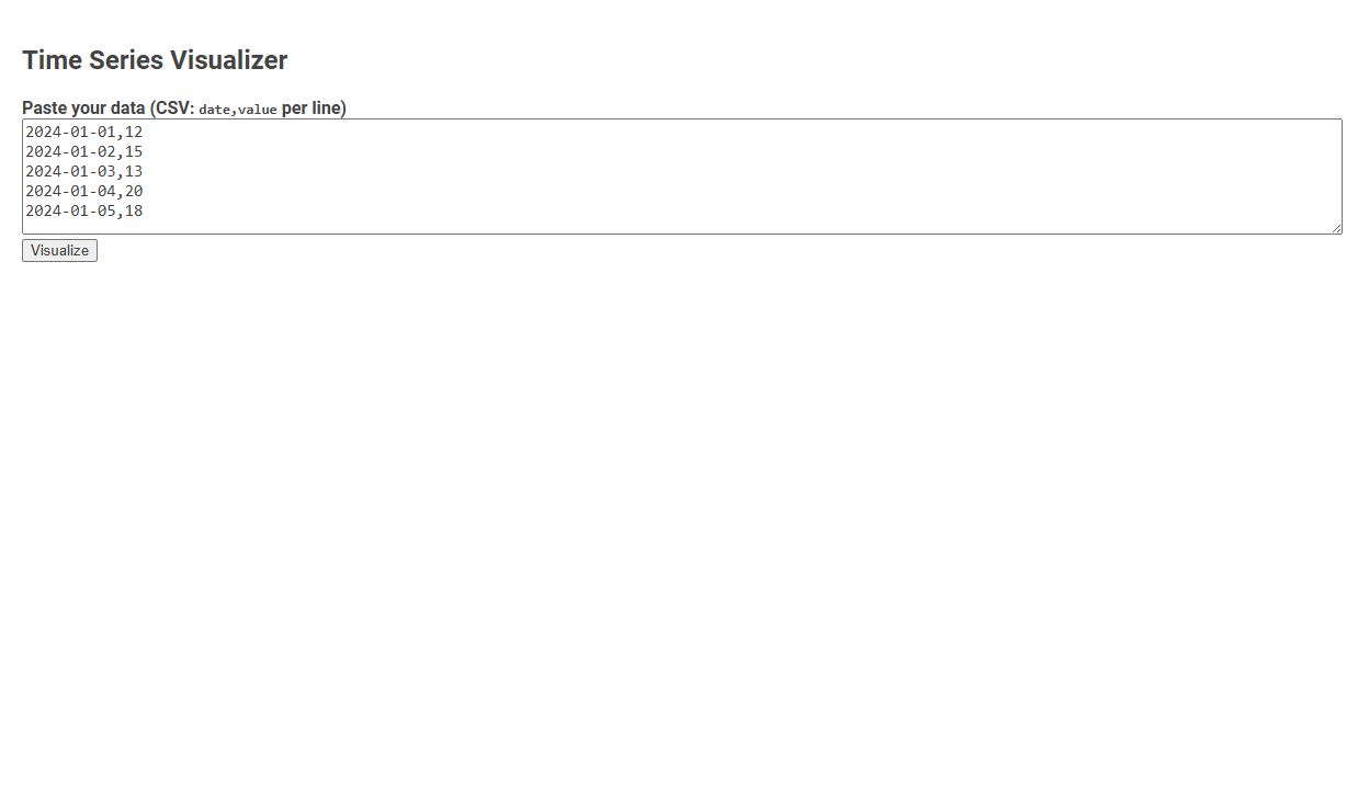
Complete Guide: How to Use the Time Series Visualizer Tool
-
Prepare Your Data
- Your data should be in CSV format with one date and one value per line.
- Example format:
2024-01-01,12
2024-01-02,15 - The date should be in
YYYY-MM-DDformat, and the value should be a number.
-
Paste Your Data
- Copy your prepared data.
- Paste it into the large text area under Paste your data (CSV: date,value per line).
-
Visualize
- Click the Visualize button.
-
Interpret the Results
- After clicking Visualize, a time series plot will appear below the button (not shown in the screenshot above but expected from the tool's function).
- The x-axis will show dates, and the y-axis will show the values you entered.
- Check for trends, peaks, or patterns in your data visualized over time.
-
Troubleshooting
- If nothing happens after clicking Visualize, double-check that your data is in the correct
date,valueformat with no extra spaces or missing commas. - Ensure dates are valid and in chronological order, if possible.
- If nothing happens after clicking Visualize, double-check that your data is in the correct
Example Data
2024-01-01,12
2024-01-02,15
2024-01-03,13
2024-01-04,20
2024-01-05,18
Paste this example to try the tool immediately.
Introduction to Free Online Advanced Time Series Visualization Tools
Explore free online advanced time series visualization tools designed to simplify complex data analysis. These platforms offer interactive charts, customizable graphs, and real-time data updates to enhance your understanding of trends and patterns. Empower your data insights with intuitive features that make time series visualization accessible and efficient.
Key Features of Online Time Series Visualizers
Online time series visualizers offer interactive charts that enable users to explore data trends over specific intervals with zoom and pan capabilities. They support various data formats like CSV, JSON, and Excel, ensuring seamless integration and real-time data updates. Advanced features include anomaly detection, customizable alerts, and correlation analysis to enhance data-driven decision-making.
Data Preparation: Formatting Your Time Series for Analysis
Time series visualizer tools require careful data preparation, focusing on accurate timestamp formatting and consistent intervals. Your dataset should be cleaned to handle missing values and outliers to ensure reliable analysis. Properly structured time series data enhances visualization clarity and analytical insights.
Step-by-Step Guide: Importing Data into the Visualization Tool
Step-by-Step Guide: Importing Data into the Time Series Visualizer Begin by preparing your dataset in a compatible format such as CSV or Excel, ensuring timestamps are correctly formatted for time series analysis. Open the Time Series Visualizer and select the "Import Data" option to upload your dataset directly from your local drive or cloud storage. Verify that the time indices and values are accurately mapped in the preview, then finalize the import to start analyzing trends and patterns effectively.
Visualizing Your Time Series Data: User Interface Walkthrough
The Time Series Visualizer offers an intuitive user interface designed to simplify visualizing temporal data through interactive graphs and customizable timelines. Users can effortlessly upload datasets, select specific date ranges, and apply filters to highlight trends and seasonal patterns. This streamlined interface enhances data analysis by providing clear visual insights and real-time manipulation of time series components.
Customizing Visual Outputs and Chart Types
Time series visualizer offers extensive options for customizing visual outputs, allowing you to tailor color schemes, labels, and axes to fit your data presentation needs. It supports multiple chart types, including line, bar, and area charts, enabling clear representation of trends and patterns. This flexibility enhances your ability to analyze complex time-dependent data effectively.
Tips for Interpreting Time Series Graphs and Patterns
Time series visualizers help you identify trends, seasonal patterns, and anomalies by displaying data points chronologically. Focus on key indicators such as upward or downward trends, recurring cycles, and sudden spikes or drops to make informed decisions. Proper interpretation of these patterns enhances forecasting accuracy and data-driven strategies.
Troubleshooting Common Data Input and Formatting Issues
Time series visualizers often encounter data input and formatting issues such as inconsistent timestamps, missing values, and irregular intervals. Ensuring uniform date-time formats like ISO 8601 and handling null entries through interpolation or imputation significantly improves visualization accuracy. Properly formatted time series data enables seamless integration with visualization tools like Tableau, Power BI, and Python libraries Matplotlib or Plotly.
Real-World Use Cases and Application Scenarios
Time series visualizers transform temporal data into intuitive graphs, enhancing pattern recognition across sectors. In finance, they track stock price fluctuations and market trends to inform investment decisions. Healthcare uses these tools to monitor patient vitals over time, enabling early detection of anomalies and improving treatment outcomes.
Time series visualizer Tool Preview